A Daylight Guide to Jewelry Stone Colors
Compare six stone-color palettes in daylight and choose how much contrast you want against a sleeve, neckline or neighboring piece.
By Nara Charm · · Updated · 2 min read
Compare three backgrounds first
Use off-white paper, a piece of gray fabric and the sleeve or neckline you plan to wear. Walk to a window and look at each from arm’s length. A color that seems subtle in your palm may turn into the strongest detail when it sits against your clothing.
Purple, pink and warm earth tones
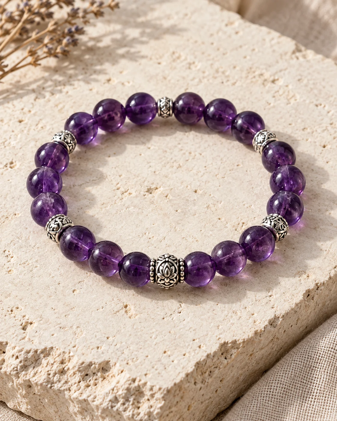
Violet. Dark amethyst can look almost black on navy. A pale cuff brings the violet forward, and a narrow silver accent separates two darker shades.
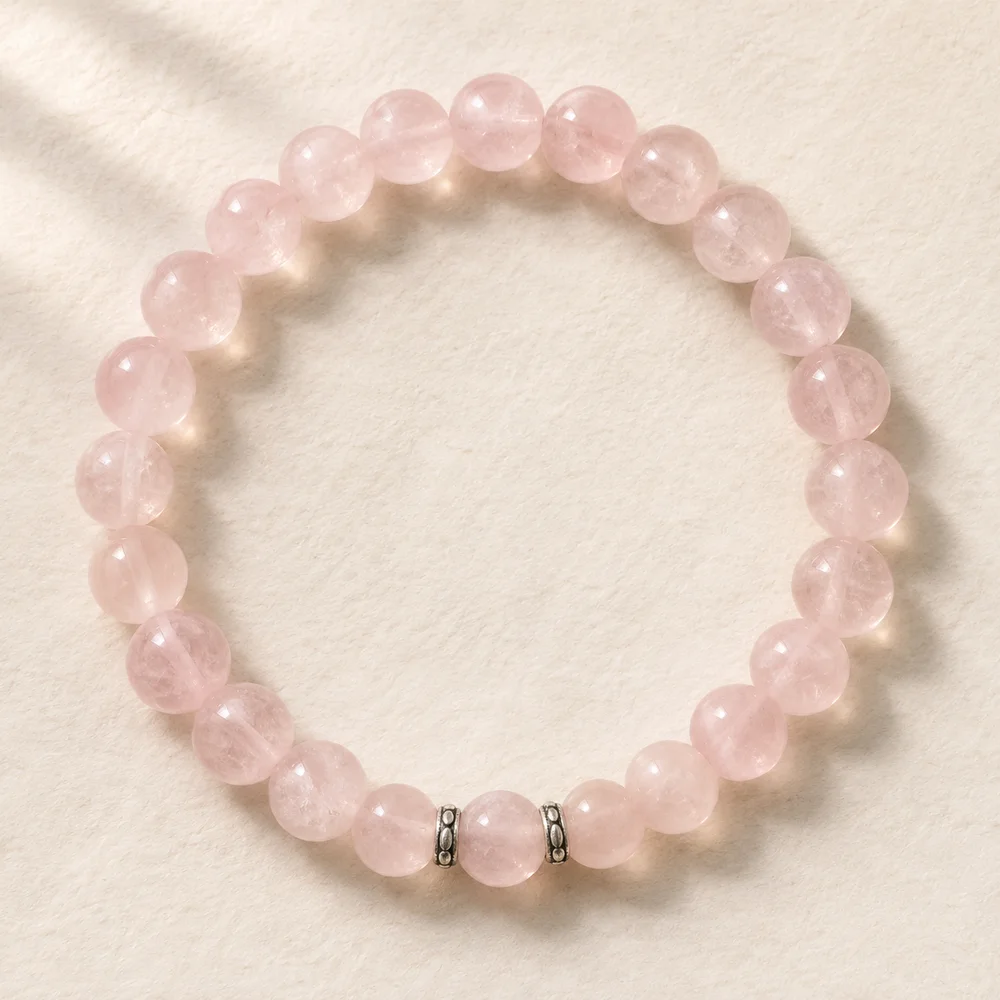
Pink. Cloudy pink quartz often reads softly against cream. On slate gray, a pale pink bead can have a more defined edge. Check a front-lit view if you are choosing between warm rose and cool blush.
Red or amber. A group of small warm beads can echo rust stitching or brown leather. One broad warm stone makes a more obvious focal point against dark denim.
Blue-green, charcoal and near-clear
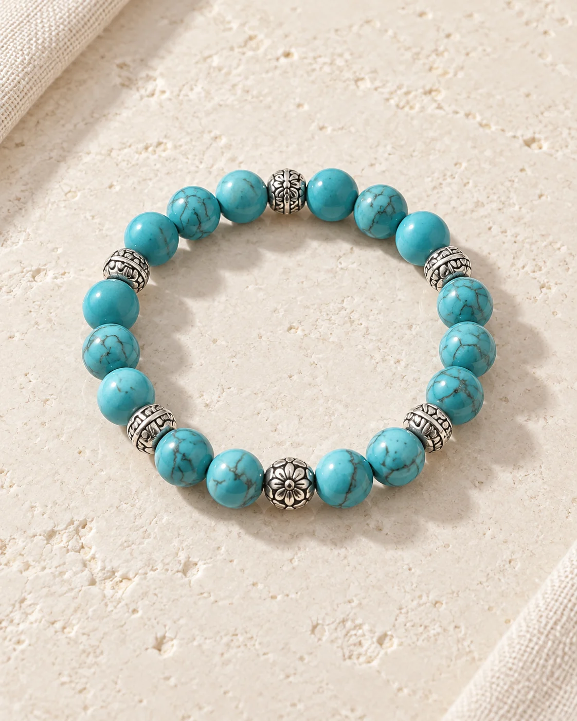
Blue-green. Pale shades can stand out against navy, while a muted blue-green looks more distinct beside oatmeal or rust. Confirm the named material separately if it matters to you.
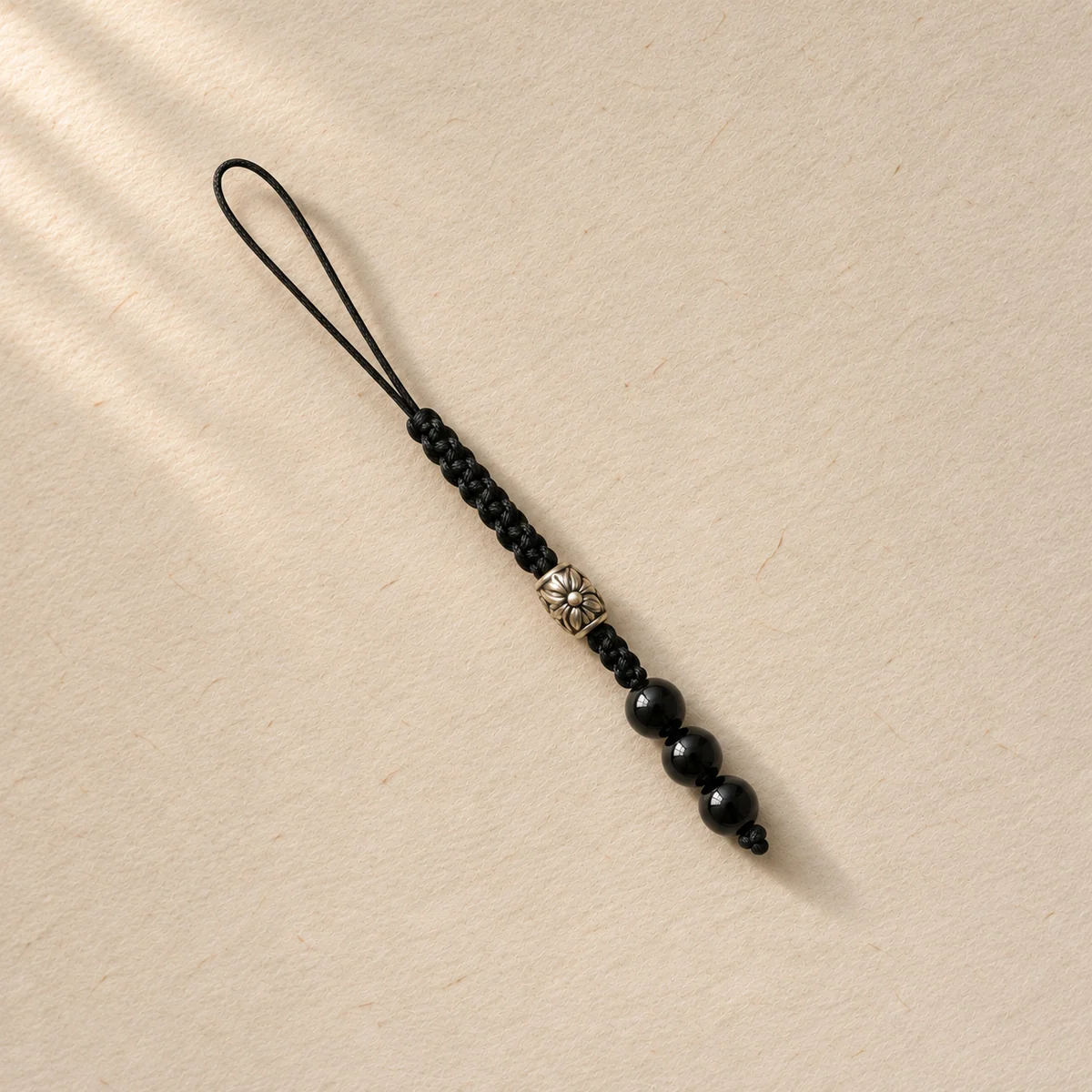
Charcoal. Compare a polished black bead and a matte one side by side. The first gives you a moving highlight, while the second may give a continuous gray outline against dark cloth.
Clear or nearly clear. Check what shows through the piece. On pale fabric, a bead may appear primarily through its edges. On dark fabric, one fine bright line can be enough to make it visible.